Product design · iOS · Health
Helping students recover sleep without guessing when to nap
Inspired by Apple Health, Oura, and WHOOP, Dozy turns sleep history into personalized nap recommendations.
Visit appdozy.com ↗- Role
- Founder, Product Designer, iOS Developer
- Timeline
- 2 weeks
- Focus
- User Research, Prototyping, UX Design, User Testing, iOS Dev
The Problem
Students know they’re tired.They don’t know whether they should nap.
What exists today
Students often experience fatigue during classes, exams, and late-night work, but deciding whether to nap is confusing. A nap can help recovery, but the wrong timing or length can make users feel groggier or disrupt nighttime sleep. Existing sleep apps show sleep data, but they rarely turn that data into a clear next step.
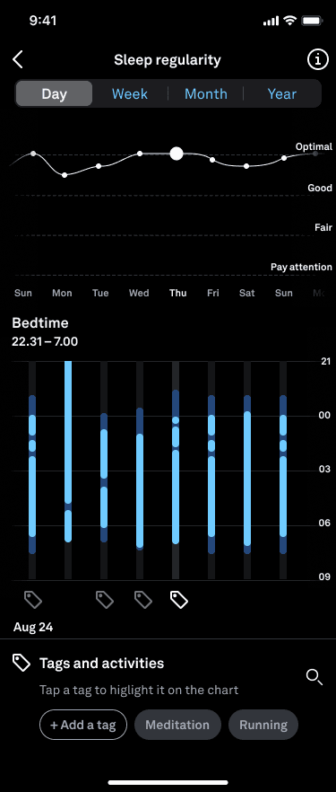
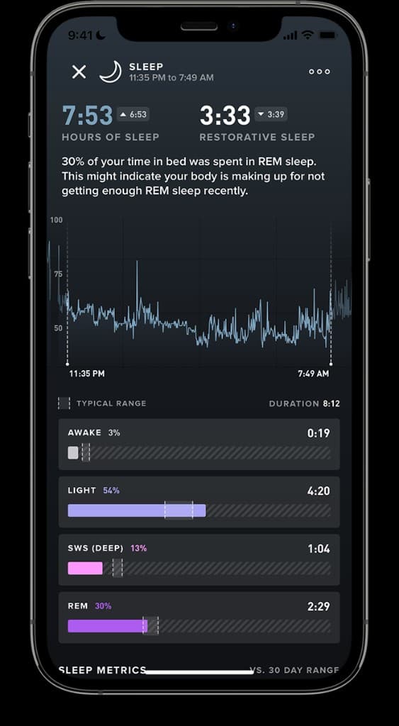
Competitive Research
Sleep trackers show what happened. Dozy helps decide what to do next.
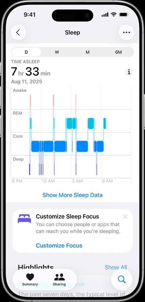
I studied sleep tracking apps like Apple Health, Oura, and WHOOP to understand how they communicate sleep duration, recovery, readiness, trends, and habit feedback. These products are strong at collecting and visualizing data, but they often leave users to interpret what the data means on their own.
Design opportunity
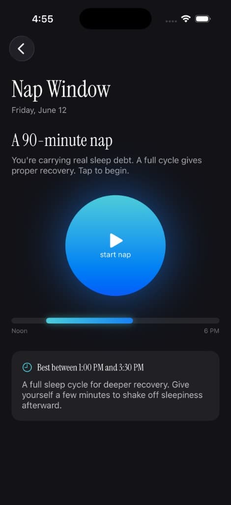
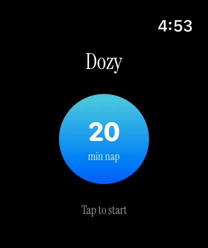
- Should I nap?
- When should I nap?
- How long should I nap?
Research
People want to take powerful naps — guilt free.
User personas
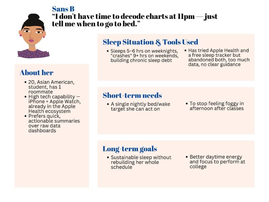
“I don’t have time to decode charts at 11pm — just tell me when to go to bed.”
Findings
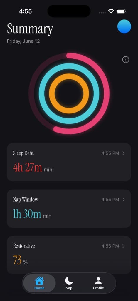
- 1Users cannot easily quantify sleep debt.
- 2Users fear naps ruining nighttime sleep.
- 3Most naps are impulsive.
- 4Existing sleep tools focus on tracking instead of action.
Insights
- 1Users don’t want more sleep data. They want a recommendation.
- 2Timing matters more than duration.
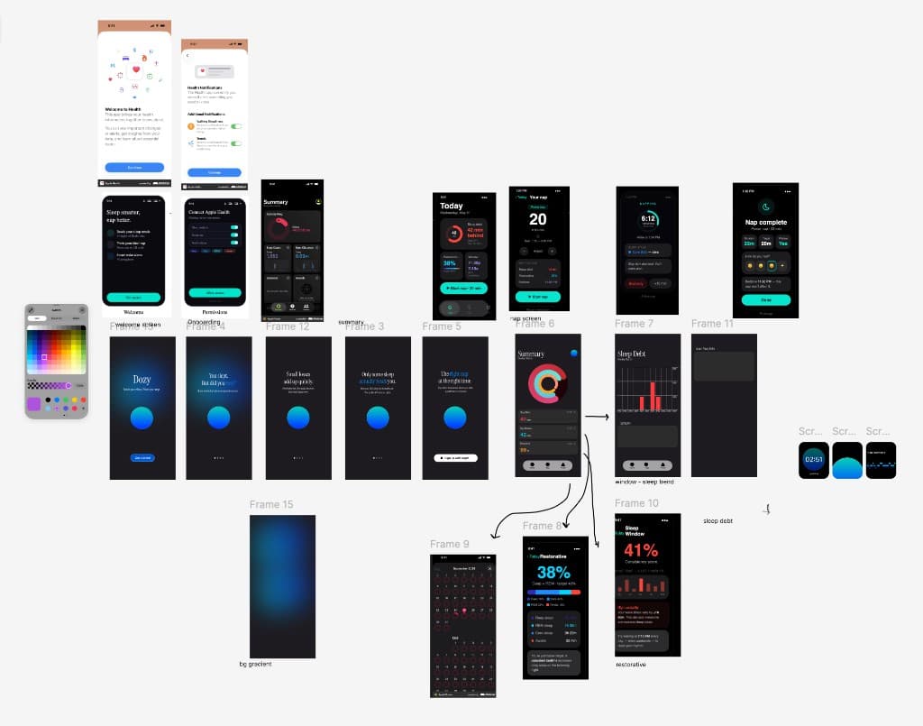
Design Exploration
Designing for people, not data.
Sleep is technical — stages, cycles, debt, restorative ratios. Most apps expose all of it and leave users to make sense of the numbers.
I wanted the opposite: hide the complexity and keep the experience calm and intuitive, even for someone who has never thought about REM or sleep debt.
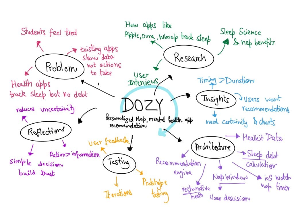
Reflection
What recovery actually looks like.
Better rest, better headspace.
Poor sleep and mental health are deeply linked — fatigue feeds stress, anxiety, and low mood. By helping users actually recover instead of just tracking their exhaustion, Dozy supports mental wellbeing at its root.
A nap is a tool, not a cure.
A nap reduces sleep debt and restores alertness, but it doesn't erase that debt completely — real recovery takes consistent, quality sleep over time. Sleep is also shaped by more than duration: temperature, light, noise, stress, and caffeine all affect how restorative it actually is. Dozy points users in the right direction, but it works best alongside healthy habits and a calm sleep environment — one piece of the bigger picture, not a replacement for consistent rest.